

Case Study: ESCA.
ESCA is an app designed to help users keep track of what perishable food they have and how much longer it will be good for. They have the ability to look up recipes that will help them use up items before they go bad. In addition, when they use items instead of throwing them away they gain points on a leaderboard of their friends, thus keeping their food saving motivations high.
Timeline: 10 Days
Role: UX Designer, Writer & Asset Collector
Tools: Sketch, Figma & InVisionapp
Team: Carolyn Cathcart, Brian Yew, Denzel Coke, Ana Macedo, Rebecca Lee, Brendan Kirby & Feo Tchougainov
Project Type: Educational
Table of Contents:
Click on a subject of interest below or scroll the entire case study.


Problem Space
Design Challenge.
In the first week of my User Experience Design education at BrainStation we were randomly placed in teams and tasked with completely our first design sprint. The challenge that was posed to us was how we could help to reduce food waste in Canada from the production, selling and consumption.
Introducing the Problem.
Lots of Food.
An excessive amount of food is produced each year that exceeds the local needs for consumption. This can be linked to grocery stores carrying large amounts of food that often go to waste as they cannot be consumed before expiration.
Imperfect.
Often food goes bad because it does not appear ‘perfect’ or up to high consumer standards for the appearance of food. Imperfect appearance can lead a consumer to believe the food is no longer good and must not be eaten and thrown out.
Too Cheap.
When people can comfortably afford the food they are buying they are more likely to waste it as it does not seem that valuable. When food is plentiful and inexpensive at grocery stores it reinforces the idea that it does not matter if the food goes to waste.
Startling Stats.


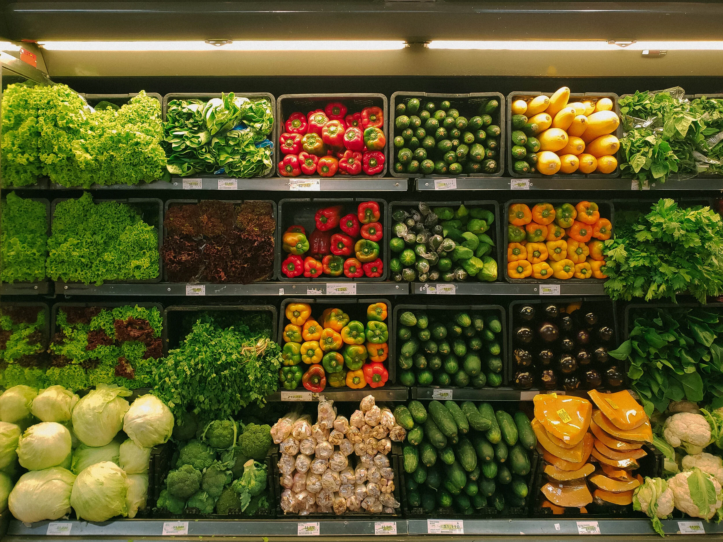
Research
What’s out there.
Once we absorbed the stats on the issue we felt that the best solution was to help Canadians use up what food they have at home as that is where the primary source of food waste in the country. We began researching what apps existed in the marketplace that kept track of what food you had at home and when it was close to expiration.
Market Research.
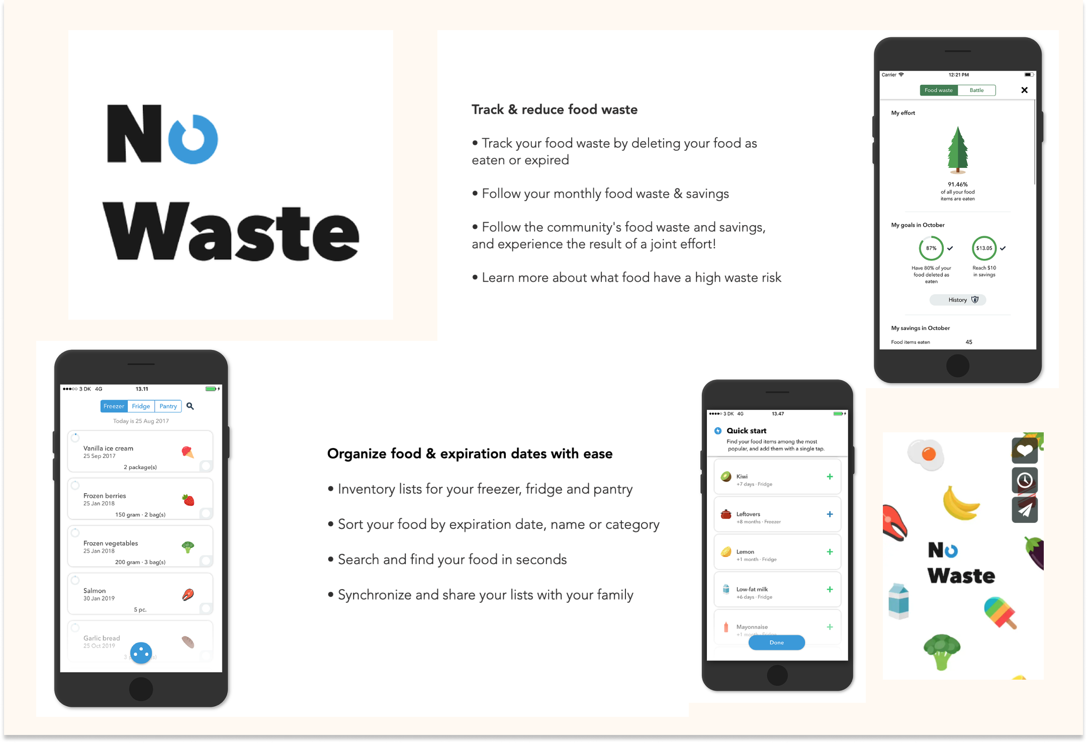
When we began searching ‘food waste’ in the app store we discovered an impressive number of options available to make a positive impact. Most options however, were designed around restaurants and grocery stores selling off food that was close to expiration and a greatly reduced cost. The only app that was designed around reducing food waste in the home was No Waste an app , very
impressively, designed and coded by a 17 year-old Danish student. No Waste keeps track of what you have at home and where the best place to store certain types of food are in order to preserve them longest. Despite these awesome features the app lacked engaging visuals to remind and motivate the user to use up soon to expire food.

How might we make meal and grocery planning more convenient so that impulsive shoppers use all the food they buy?
Interviewing People.
As we all purchase, consume and waste food we each took it upon ourselves as a team to interview the people in our lives to get a sense of why the average Canadian wastes food and what their grocery shopping habits are.
Quality.
The vast majority of people that we interviewed mentioned quality as the most important factor for them when buying and consuming food. When feeling unsure about the quality of food already purchased often led to unnecessary food waste in the home.
Convenience.
When wasting food many of the people interviewed mentioned that convenience played a role in the reason why. After a long day many people opt to order food in rather than cooking the food they have at home which inevitably led to them wasting food already purchased.
Trying.
Although everyone that was interviewed admitted to wasting food they also felt guilty about it. To avoid it from always happening interviewees mentioned freezing food before it goes bad and making smoothies from fruit and veg close to expiration to reduce waste.
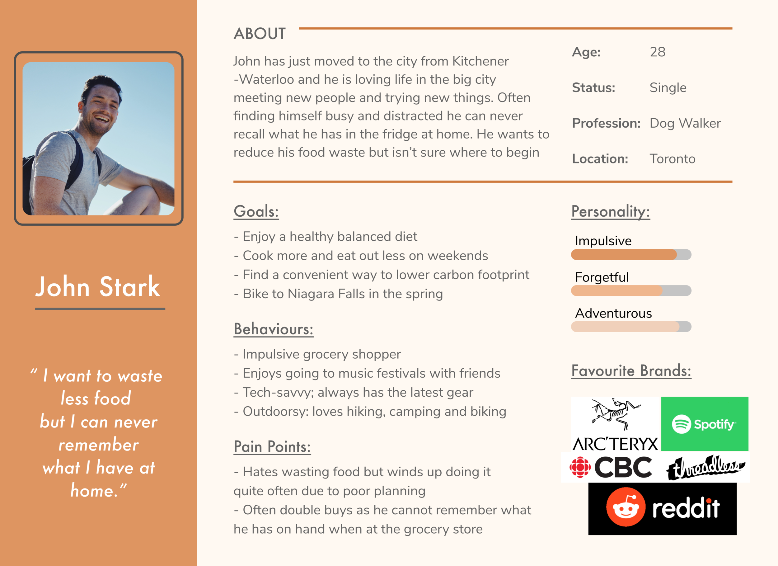
Persona:
Considering all that we had learned from our research and interviews we created this persona as our ideal target user.
Journey Map:
Now that we had a clear vision of who we were designing for we imagined what their day-to-day life might look like as they interact with the app as the meal plan and grocery shop.

Opportunity Selection.
GOAL
We wanted to create a platform that could truly help reduce consumer food waste in a meaningful and creative manner.
OBJECTIVE
We wanted to show how easy it could be to use up all the food you buy while encouraging others to do so.
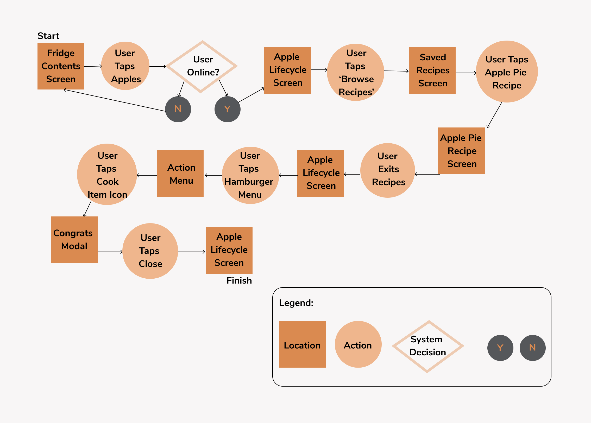
USER FLOW SELECTION
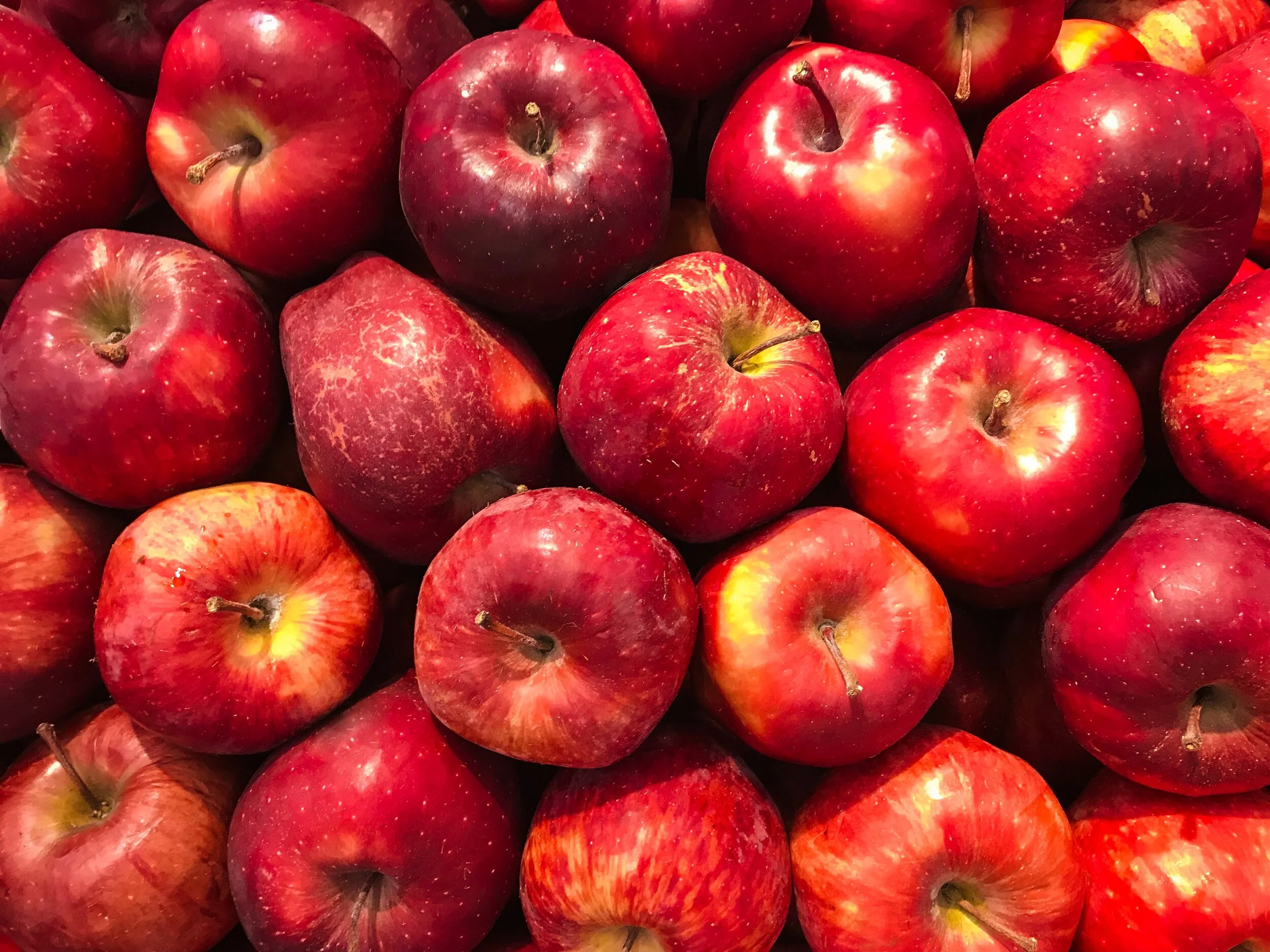
The core user flow we chose to focus on was to show John checking on the contents of his fridge, realizing his apples are about to expire and chooses to use them in a recipe he has saved on the ESCA app. This flow helped to illustrate the gamification aspect as John would gain points for using up his items rather than tossing them.
User Flow:

Visual Identity
Ideation.
With our user flow decided upon the team broke up individually and began to sketch out ideas for how to display the current state of the food within the fridge and what the recipe screen would look like. Sharing afterwards the following sketches were used as the primary inspiration.
Team Sketches:
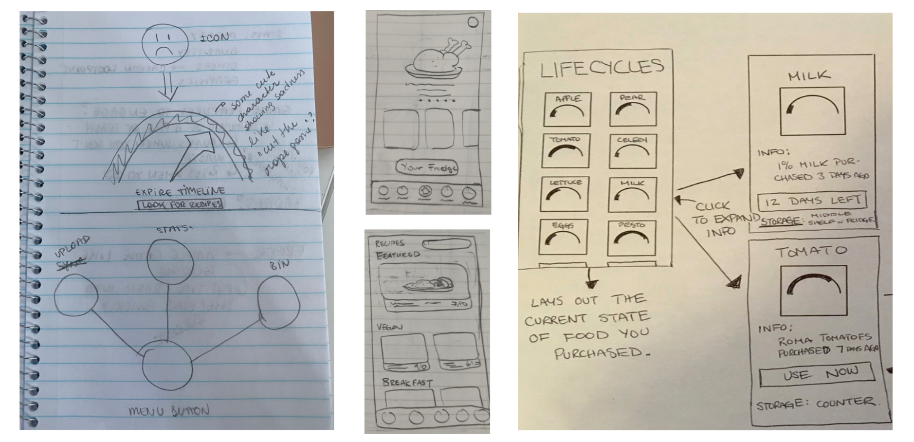
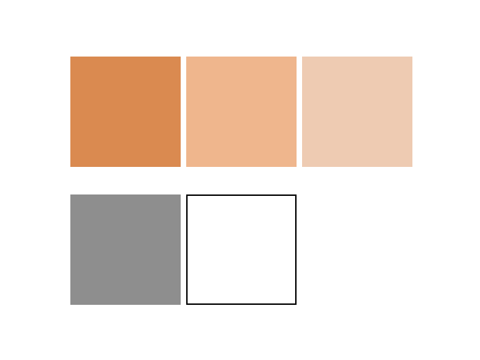
Team Font & Colour Choices.

Wanting the app to appeal to the millennial market in particular we wanted to go with a colour palette and font choice that would appeal to this demographic.
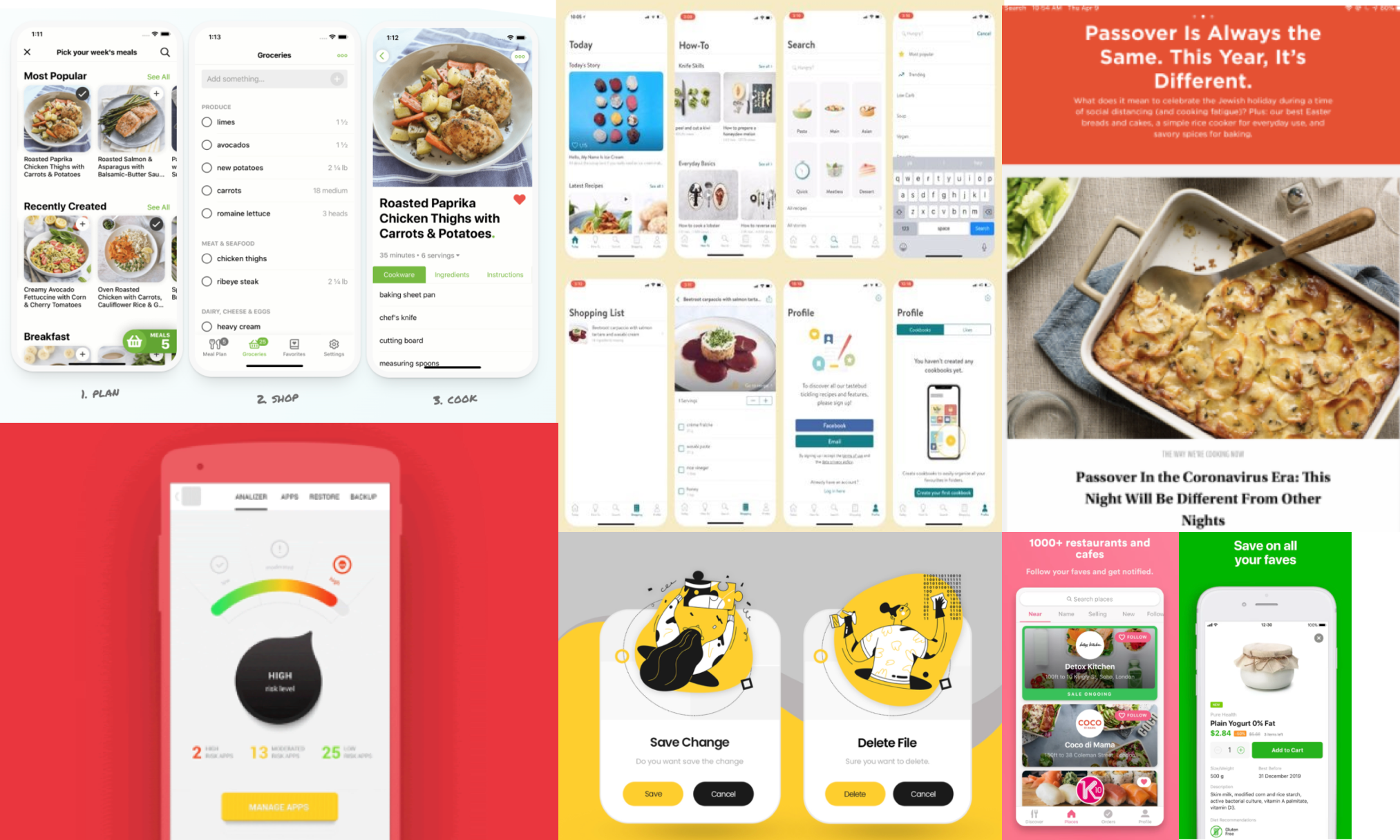
Inspiration Board: UI Elements

Final Design
High Fidelity.
Now that the team was armed with a type choice, colour palette, and a clear task flow in mind we worked together to produce the screens necessary to create our prototype. A selection of the main screens are seen here below and is followed by our final output; the prototype which is here for you to click through.

Mockup

The Prototype
*Please refresh page before clicking
Changes based on feedback.
After conducting some preliminary user testing we made some changes immediately after to improve the usability. These changes have already been uploaded to the prototype above.


Reflections
Notes on my First Design Sprint.
When I think about those first ten days of BrainStation where the educators decided the best way to learn was by doing and threw us into our first design sprint before we had really learned anything about UX Design, it seems like a millennia ago rather than just four and a half months. I have learned so much since then so looking back I am so impressed with what we were able to create with limited knowledge, however there are many changes that I would like to implement:
Re-order the flow so that there is no need to backtrack
Labelling of all icons to reduce possible confusion
Built in filters that would only show recipes relevant to the items about to expire
Clarify how the point system would work - points per item? per recipe completed?