

Case Study: Figo Grow
FIGO GROW is an app designed to onboard first-time bankers by providing a dashboard that allows the user to feel in control of their limited funds.They have the ability to separate funds into spend and save accounts, access a chore list with preset dollar amounts to earn cash, and to set goals by uploading pictures of desired items and setting a purchase date to motivate them to save.
Timeline: 5 Days
Role: UX Designer, Stitcher, Writer & Asset Collector
Tools: Figma & InVisionapp
Team: Carolyn Cathcart, Nadia Shervani, Michelle Lam & Laura Sajdik
Project Type: Educational
Table of Contents:
Click on a subject of interest below or scroll the entire case study.


Problem Space
Design Challenge
“ Our customers have been asking for a native mobile app for a long time. However because customers can already manage their personal finances through the responsive website, we want our mobile app offering to provide value that uniquely speak to each of our target customers types. ”
As a student at BrainStation I participated in an RBC sponsored design sprint which last 5 days. 4 days to research the problem, sketch and iterate ideas, design, prototype and test, 1 day to compose and rehearse the presentation. We were presented with an imaginary bank:
Figo Bank is a friendly and approachable brand, with the primary goal as a business to help simplify the many elements of saving, spending and investing money.
Figo Bank currently offers typical personal banking services through a responsive website (supporting desktop to mobile) to manage the following: Chequing Accounts, Savings Accounts, Credit Card Accounts

Demographics:
From the three demographics that we were presented with our team decided to focus on preteen first-time bankers.
Client Constraints.
Our solution had to be designed using ‘Avenir’ as the primary font but we were permitted to use an accompanying font if we chose to.
Our design solution must reflect the primary brand colours but were encouraged to use colours sparingly. Our solution also needed to be accessible to the widest audience; thus must be WCAG AA Compliant.

Introducing the problem.

Learn.
The first step in teaching children about money is the difference between wants and needs. Explaining that food, shelter and clothing fall into the needs category and everything outside of that is a want.

Save.
Defining a savings goal can assist the child in staying motivated to save money. Breaking down the total into manageable chunks will help the child see how to achieve their goal more easily.

Grow.
By offering a means of earning additional funds through household work or matching a contribution made towards a savings goal, you can show your child the value of waiting and allowing their money to grow.
Source: Gail Vaz-Oxlade “Teach your kids about money”

Research
What’s out there.
Once we had decided as a team to move forward with a solution for first-time bankers it was essential that we performed some quick market research to understand what already existed in the market and how we could improve on existing solutions. Additionally we performed some inspiration finding by looking at some existing ‘fintech’ apps to get a good sense of structure and layout.
Market Research.
We decided to begin looking at what was available for allowance management in the app store and what existing banks had on offer to attract first-time bankers. Most of what we found available to manage allowances and chores in the app store were designed in a very childish or too adult in manner as they were a
mostly dashboards for the parents and not intended for the child to use. The first-time bankers products we found from existing banks inspired us to offer a sign-up bonus to get the child started on their path to financial literacy, as a lifelong customer of the bank and also instilled good saving & spending habits.

iAllowance - Felt Childish

RoosterMoney - Felt Adult

RBC First-Time Account - $25 Sign-Up Bonus

Commonwealth Bank - Youth Bankers App with Chore List

How might we help preteens feel in control of their finances in order to help them achieve their tangible goals?
Interviewing Parents of Preteens
Early & Often.
All of the parents that we interviewed expressed that they wanted their child to learn the importance of goal-setting and saving early on so that they carry the good habit throughout their lives.
Visual.
When motivating their children to save parents that were interviewed expressed their child’s need for the goal to be something they could picture rather than an abstract concept like ‘the future’.
Self-Discipline.
Parents that we interviewed wanted their children to be able to exercise self-discipline when they were spending the money that they had earned. Once again hoping that they could curb impulsive spending early on in life.
Chores.
Not all parents interviewed believed in paying children for the chores they completed in the house. Interviewees were divided between the two camps; it was one of few ways for the child to earn money & they live in the house thus they must help out.
Control.
Knowing that the only way for the children to learn about financial literacy would be to let them have the control over what they spent their money on with the hopes they would learn the benefits of saving over time.
Knowledge.
When considering their child using an app to manage their money parents interviewed wanted to have an ability to view their child’s spending and saving habits.
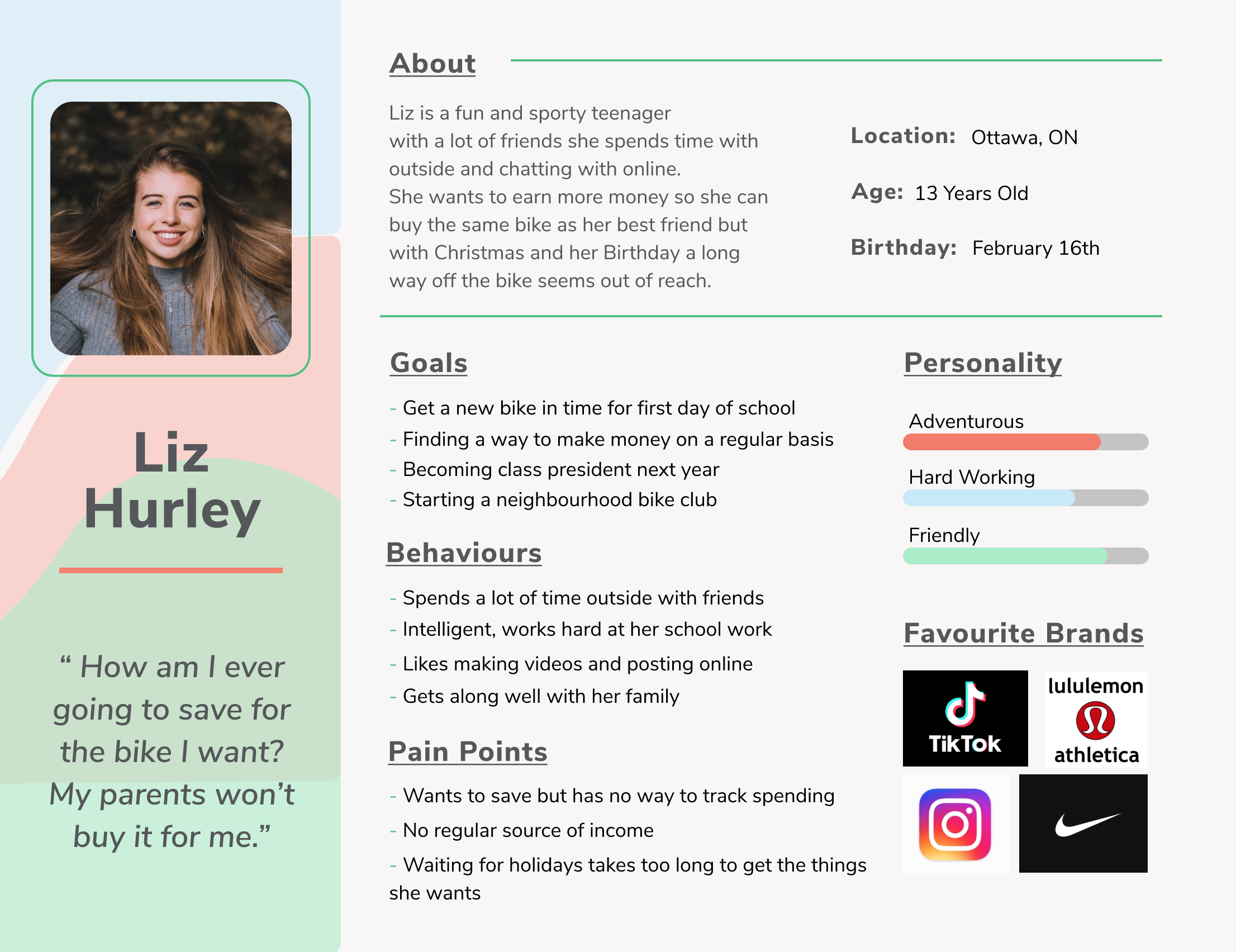
Persona:
Considering what we learned from our interviews of parents of preteens and our own experience with preteens that we know developed the following persona as our ideal target user for our product.
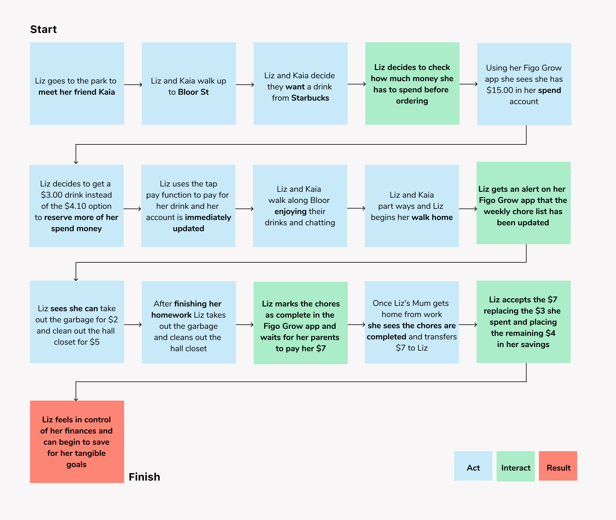
Journey Map:
We then considered what an average day in the life of Liz Hurley might look like as she went about her regular activities and interacted with the app at predictable intervals.
Opportunity Selection
GOAL
To show how the app will motivate Liz to spend smartly and focus on saving for her tangible goal.
OBJECTIVE
To create a digital product that will teach financial literacy in a fun and engaging way.
USER FLOW SELECTION
The core task we wanted to focus on was Liz receiving a challenge from her parents to save for the bicycle she keeps asking for to illustrate that with outside influence and a set target in mind Liz will be more likely to save and reach her goal.
User Flow:


Ideation
Pen & Paper.
Once we had a clear idea of how we wanted the application to function it was time to begin iterating on the user interface elements. Sketching individually and then uploading to our team’s Figma board we discussed the most successful ideas and moved forward with the digital design.
Team Sketches:

Inspiration Board: UI Elements
We also spent some time inspiration finding on Dribble and existing ‘fintech’ apps to help inform our design decisions.


Final Design
High Fidelity.
Now that the team was armed with a type choice, colour palette, and a clear task flow in mind we worked together to produce the screens necessary to create our prototype. A selection of the main screens are seen here below and is followed by our final output; the prototype which is here for you to click through.

Mockup:
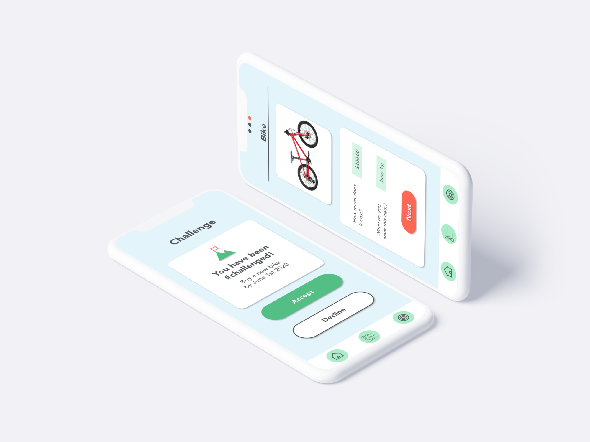
The Prototype:
*Please refresh page before clicking

Usability Test Results
Getting Feedback.
After running our usability test through five participants we derived some key insights and areas for improvement from watching them engage with the prototype.
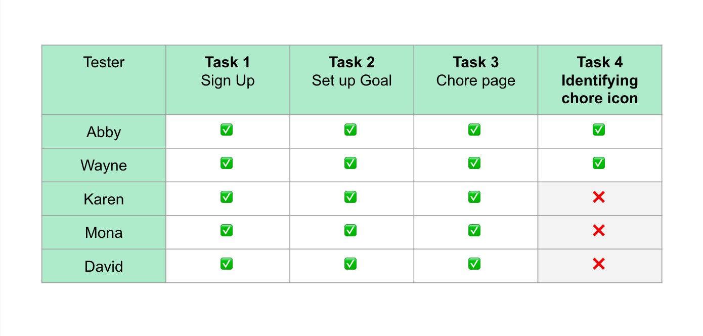
User Test Insights.
In addition to completing the testing our users also provided critiques that we would implement moving forward to enhance usability.
Changes moving forward:

Improving on our chore list icon should be top priority, perhaps “a mop and bucket icon?” said one user. Users also wanted the ability to split earnings into both accounts rather than just one to feel even more in control of their earnings. They did, however love the visual representation of the goal as a mountain the are climbing, “it reinforces the idea of hard work!” said another user.
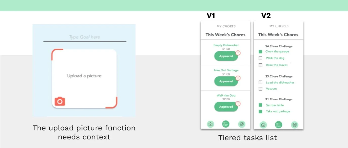
Additionally a few users were stumped for a few moments about the upload a picture function, “maybe it should just say ‘upload a picture of your goal’ instead of just picture” said one user. When critiquing the chore list another user made a great suggestion: “it would be cool if the task list was tiered, it would give a sense of working harder gets you more money over time”. We mocked up a version 2 to demonstrate what that might look like.
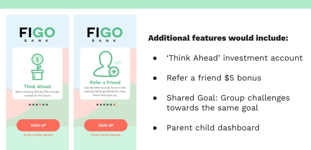
If this had been a longer design sprint there were a lot of other great ideas that the team came up with that would definitely add to its usability and its performance as a product that would attract and retain customers for Figo Bank.

Reflections
Notes on a Second Design Sprint.
On Monday of this design sprint I was unsure if we could produce anything of much value in such a short amount of time that would impress someone from the design team of a major bank. I was totally wrong. I mean totally and completely wrong. The ideas that we came up with, our ability to work successfully remotely, our use of a new software (Figma!) - EVERYTHING! We achieved something I could imagine building out with a tool chest of features to bring financial literacy to young people everywhere. It was an enriching experience that I learned so much from and wish I could do all over again.